Web Experience System
What 20+ responsive projects taught me about hierarchy, components, conversion, and implementation.
A cross-project study of responsive web experiences created for professional services, consulting, wellness, photography, pet care, creative studios, and personal brands.
The value was not twenty isolated websites.
Each project created another opportunity to test how business goals, audience expectations, content hierarchy, calls to action, forms, pricing, schedules, and responsive behavior work together. Across multiple industries, repeated patterns began to form a reusable design system.
Rather than approaching every brief as a blank artboard, each commission fed back into a unified engine. Whether architecting high-retention fee structures for boutique management consultants or step-by-step booking engines for wellness providers, the underlying mechanics of friction, readability, and confidence remained rigorously mathematically consistent.
Moving beyond arbitrary one-off pages: codifying layout mathematics, fluid typography, and ergonomic user flows into an elastic multi-tenant foundation.
Systematic Repeatability
Tokenized type and spacing matrices eliminate ad-hoc CSS drift, allowing complex layouts to resolve crisply across viewports without breaking baseline vertical rhythm.
Cross-Industry Coherence
Proven patterns adapted gracefully across high-trust professional firms, editorial studios, and high-touch service booking without visual homogenization.
Zero-Defect Hand-Off
Direct engineering implementation closes the fidelity gap between static Figma artboards and shipping production DOM, validating accessibility and rendering latency early.
The 11-Stage End-to-End Pipeline
A continuous design engineering lifecycle ensuring client expectations translate seamlessly into verifiable, fast, accessible digital experiences.
Business Goal
Unpacking monetization model, client conversion thresholds, and commercial constraints.
User & Market Research
Auditing user intent, competitor UX friction points, and device distribution patterns.
Information Architecture
Defining taxonomy, navigation depth, deep-linking trees, and multi-tenant pathways.
Content Hierarchy
Balancing scannability, primary micro-copy, trust anchors, and progressive disclosure tiers.
User Flow
Mapping decision gates, error recovery loops, and checkout conversion paths.
Visual Direction
Curating bespoke typographic pairings, mood boards, tonality, and color harmonies.
Responsive Interface
Figma component systems spanning 390px, 768px, and 1200px responsive constraints.
Interaction & State
Defining focus rings, hover micro-lifts, modal transitions, and dynamic keyboard access.
Implementation
Translating tokens into semantic HTML5, utility-first CSS, and resilient script hooks.
Testing & A11y Audit
Lighthouse profiling, cross-browser validation (Safari/WebKit), and screen-reader checks.
Continuous Deployment
Zero-downtime edge edge distribution, Cloudflare CDN rules, and post-launch traffic analytics review.
Four Strategic Choice Points
Where conventional agency web practices break down, and how systematic engineering decisions protected client conversions.
Reuse a template - or reuse design principles?
Pre-built templates enforce rigid layout dogmas, forcing distinct businesses into generic, interchangeable aesthetics. Clients end up altering their core value proposition just to fit into an arbitrary marketing card slot.
"The system reuses layout logic, spacing rules, components, and responsive behavior without forcing every business into the same visual identity."
- Fixed markup structures
- Inflexible card grids
- Homogenized font stacks
- Fragile overrides & CSS debt
- 8px Baseline Spacing matrix
- Modular clamp() scaling
- Pluggable typographic scales
- Contextual layout ergonomics
Lead with decoration - or lead with information hierarchy?
Decorative visual gimmicks (floating glass cards, saturated gradients, erratic kinetic scroll-jacking) dazzle in Dribbble mockups but confuse visitors, inflate page payloads, and directly degrade transaction conversion intent.
"Page structure begins with the action the visitor needs to understand or complete. Typography, imagery, color, and motion support that hierarchy rather than competing with it."
Use one long form - or guide users through a service decision?
For a pet-service booking experience, the flow was divided into availability, booking details, estimate, add-ons, updated total, confirmation, and booking request.
Stop at the design file - or use implementation as feedback?
Designs conceived purely in vector canvases fail to account for dynamic line-wrapping, viewport jumps, localized latency, OS-specific font metrics, and accessibility constraints. Designers who stop at the Figma file create unintentional friction for engineers and compromise production polish.
"Building and testing the pages exposed responsive, content, performance, and component issues that static mockups could not reveal. Implementation became part of the design loop."
System Foundations
Eleven interconnected foundational layers powering 20+ responsive experiences with minimal code footprint and uncompromising craft.
Typography Scale
Fluid modular hierarchy governed by CSS clamp(). Manrope for confident, architectural display paired with Inter for dense legible body copy.
8px Spacing Grid
Strict baseline tokens (4, 8, 16, 24, 40, 64, 96, 128px) standardizing margins, component gutters, and vertical cadence across every screen size.
Grid & Breakpoints
12-col desktop (1200px max, 24px gutter), 8-col tablet (768px, 20px gutter), and 4-col fluid mobile (390px, 16px gutter) layout matrices.
Navigation Patterns
Dual-tier sticky backdrop headers, tactile bottom drawer sheets on mobile, and semantic breadcrumb trails for multi-level case exploration.
Cards & Surfaces
Deliberate surface elevation shifts replacing loud borders. Crisp resting shadows and subtle 2px lifts on interactive card hover states.
Calls to Action
Primary deep teal (#176B73) conversion anchors paired with secondary ghost treatments and directional feedback glyphs.
Forms & Inputs
Inline validation states, ergonomic input padding, high-contrast focus rings with zero outline offset, and predictive auto-complete styling.
Pricing & Ledgers
Tiered comparison grids with transparent line-item fee breakdowns, annual/monthly switches, and dynamic tax calculation summaries.
Schedules & Booking
Matrix availability slot pickers, instant timezone normalization, recurring series booking toggles, and instant calendar ICS export hooks.
Content Sections
Constrained 720px maximum reading columns preventing eye strain, paired with asymmetrical sidebars and highlighted executive quotes.
Interaction & Transitions
Restrained 200-350ms cubic-bezier(0.16, 1, 0.3, 1) transitions. Micro-elevations on pointer interaction, smooth drawer entrances, and strict adherence to prefers-reduced-motion directives.
Selected Work Gallery
Eight verified production implementations demonstrating the system's adaptability across diverse industries, interaction models, and conversion goals.

Professional Services
Intended Action: Retainer Inquiry & Practice Overview. High-trust editorial layout.

Management Consulting
Intended Action: Whitepaper Access & Partner Consultation. Data-dense layout.

Wellness & Yoga Studio
Intended Action: Class Schedule & Membership Pass Purchase. Calming rhythm.
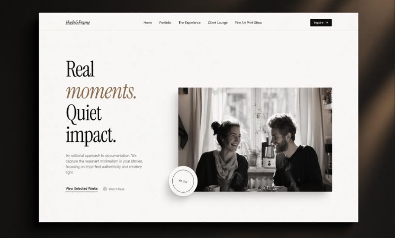
Architectural Photography
Intended Action: Portfolio Curation & Commission Booking. Minimalist framing.
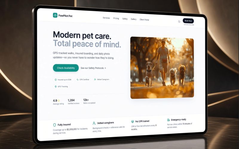
Pet Services & Boarding
Intended Action: Multi-step Guided Booking & Care Add-ons. Low cognitive friction.
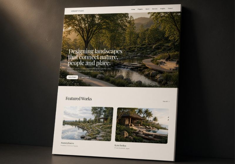
Creative Design Studio
Intended Action: Case Study Deep Dive & Client Pitch. Asymmetrical pacing.

Personal Brand & Advisory
Intended Action: Speaking Engagement & Newsletter Signup. Single-column focus.
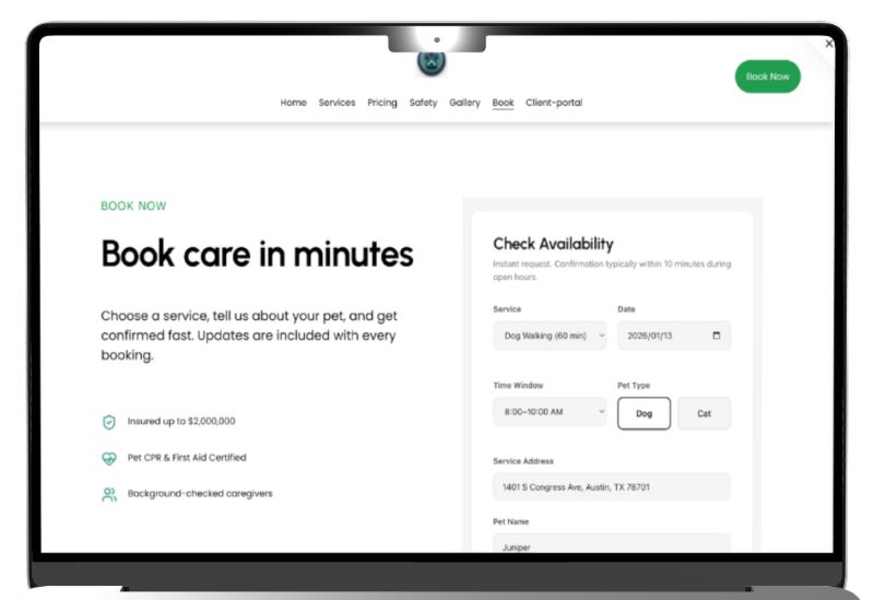
Client Portal & Scheduling
Intended Action: Real-time Slot Reservation & Document Hand-off. Functional state.
Outcome
The practice produced a reusable set of responsive patterns and a more integrated workflow from business goal and information architecture through implementation, QA, and deployment.
Live production properties deployed across diverse commercial sectors.
Flawless semantic DOM landmarks, color contrast, and keyboard operability.
Exceptional runtime reactivity meeting Google Core Web Vitals thresholds.
Strict Tailwind utility tokens eliminating undocumented inline exceptions.
Reflection & Next Horizons
What continuous execution revealed about component scaling, governance, and the future evolution of this design system.
Formal Component Documentation
Document the component system more formally into an open-source living styleguide with interactive playground states, prop tables, and copy guidelines.
Content Density Benchmarks
Compare behavior across different content densities and industries - systematizing how tabular financial grids and spacious luxury editorial share the same core tokens.
Automated Performance Budgets
Expand automated CI/CD accessibility checks and bundle size assertions to flag unoptimized visual assets before code merge.
Service-Design Deep Dive
Turn the booking and client-portal work into a dedicated service-design case study highlighting end-to-end customer lifecycle orchestration.
EXPLORE EXPERIMENTS
Creative engineering prototypes, WebGL shaders, spatial layout experiments, and algorithm proofs.